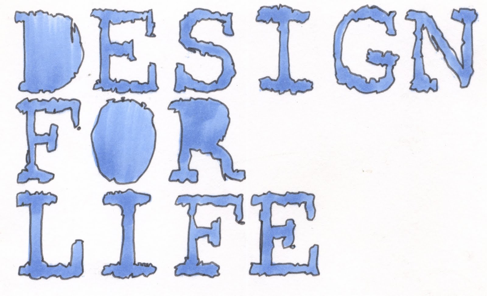
I have decided to keep looking at my first idea which was taking Graphic Design everywhere with you and knowing that this is the start of your life.
I have decided to do this by portraying this course as an exclusive club - something to be proud of and something to give everything to so as to reap the benefits.
As the Brief is to produce a Range of Products I have chosen to look at creating:-
- a large welcome banner to be placed out side the main studio.
- A role of stickers which encourage the students to critique work outside of their working space. The stickers can be placed on pieces of design around the city (stating like/dislike) and then these can be photographed ad blogged. Not only does this get them thinking about what they like/ dislike but also encourages them to start blogging early on in the year. The Stickers will also be recognisable to the other students on the course and so links in with the concept of them being part of an exclusive club.
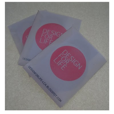
- A membership card - This should be made in a way which makes the students want to hold onto it, It should be of a fine quality and also provide benefits to the students possibly with discounts etc at stores in leeds (something I need to look into)
- A mug, stating the simple phrase Graphic Design is for life and being the packaging for the other 2 products. A mug, to me, represents home life and also drinking coffee. By linking the course with home, the students will see that it is something that should be taken everywhere. And also linking it to coffee shows the need to keep energized and expresses the intensity of the course.


 tests for final back design. Played around with layout and colour. Not much difference between them, but it really helped.
 As I explained earlier. I am no longer sure if I infact like the design of the back of the banner and so here is a simple variation of that. I have really simplified it and instead of adding lots of blab i have added the strap line, as mentioned before, let it take over. It is now a lot more focused and easier to take in.
 Here are the final sticker designs using the new font and also a lighter grid on the 'design for life' stickers. I felt that before the grid was too over powering when it was shrunk down so small and so just reduced the line thickness.
  I decided to go with GENEVA. It is really simple and has a really strong legibility. I think I do prefer this to the original design.
  Also tested different fonts the 2 of my favourites on the back of the banner.
  After a mini tutorial came to the conclusion that the original serif font was not as legible as it could be when it came to the large impact type on the main logo. Therefore I have tested various sans serif fonts to see which I preferred.


 I have been looking over this design and i seem to have fallen out with it. It no longer seems to be achieving what I originally anticipated it to achieve. Yes, it is simple, and legible etc but is it really really lovely to look at graphic design? I don't think it is. RE-THINK.


 The two images below are looking at the concept of 'Design for life' as being a negative thing. On the 'Hello' banner I have highlighted the word hell. Athough this is just a test and experimentation of visual Ideas I do really like the colours and layout of this banner. It all seems to work really well together.
 This is to coincide with the idea of being branded. I quickly made a stencil and thought it would be interesting to use this all over. Spray painting the words 'design for life' as a tag.