Thursday, 21 April 2011

Homework.
I had another play around at home to get an idea of the type of movement etc and to work out what works. These are really basic and I was limited for space but good to see and test what images were powerful.
Story boards of final ideas
After the final crit we realised the importance of story boarding our ideas so we have a definite idea as to where we are heading. Here are the majority of those story boards.
Although simple this is all we really needed to quickly get down some basics of movement and composition. These really helped us be in a place ready to just crack on with the stop motion work. we only have 2 days to shoot it all and so need to be in a place where we are ready to go.
Although simple this is all we really needed to quickly get down some basics of movement and composition. These really helped us be in a place ready to just crack on with the stop motion work. we only have 2 days to shoot it all and so need to be in a place where we are ready to go.
COLOUR

I think the images seem strong and the bright coloured backgrounds work really well against the brightness of the fruit without losing the objects impact. Also, considering it would be moving around the page the focus would still be on the object.


I think this is important to note as we don't really want one to be better than any other. It would work better if all objects worked on a parr together as they are all as important as one another.


What now?
After receiving the much needed feedback we decided to take a coffee break and to discuss what it all meant. We seemed to come to the conclusion that although we were enjoying and had good ideas in our heads as to what we wanted to produce from the feedback we realised that we were over complicating the message and producing something which was only half way there.
we decided to stop and ask ourselves a set of questions...
What specific problem are we trying to tackle?
How do we need this to change?
What is working?
How can we simplify what we have already done?
we decided to stop and ask ourselves a set of questions...
What specific problem are we trying to tackle?
How do we need this to change?
What is working?
How can we simplify what we have already done?
Questions we asked and feedback we received.
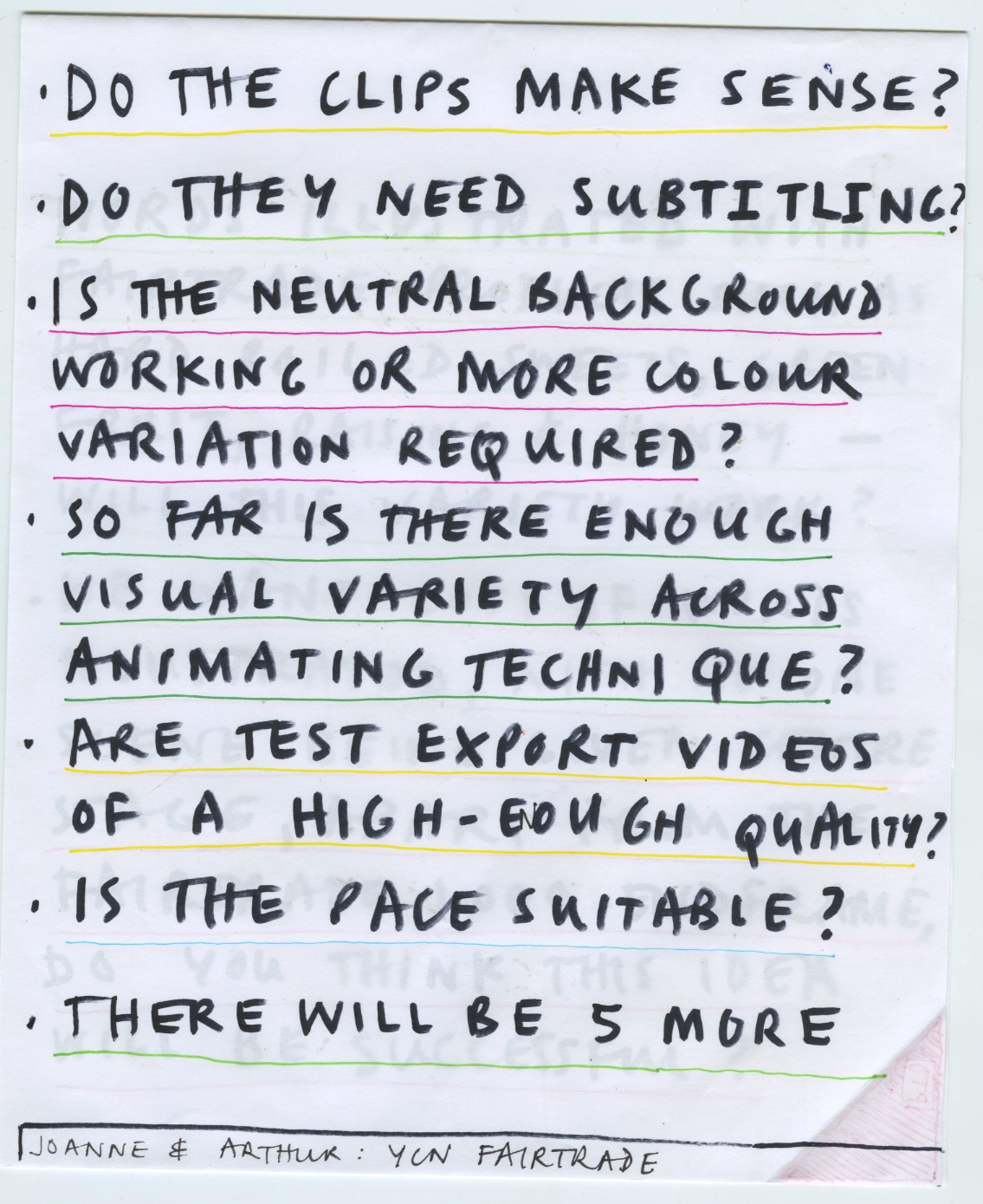
After pushing to get our work together on screen we deliberated over a set of questions we felt were important to help us move forward.
Although it seemed as though we knew exactly what we needed to do it seems as though we were probably wrong and the feedback we received definitely changed the direction we were taking.


Subscribe to:
Posts (Atom)