After talking through my work and ideas with someone who hadn't heard anything about it before (Jane) I really established and clarified my aim and purpose with this project.
Instead of just sending a pack to an office with a range of visual answers to bringing the outside in why not turn it into a sensory experience. When outside it is not just what I see that I love but the feeling, the sounds, the smells. I want to send out a pack to offices which will brighten up their work place and help them to feel refreshed during a long days work.I am going to base this within a shell of the 4 seasons. At the beginning of each season the office will receive a range of products to decorate their office with; Wall prints, floor matts, window stickers, a CD, plug in fragrances, Representing the positive things about that season.
Winter

Spring
Summer


Autumn
I have therefore tried to incorporate the seasons within these designs for the logo.
Each pack will have a background relative to the season.
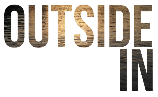
Again I do want to play around with this more but this gives an idea of image and the name itself. I am definitely sticking with 'OUTSIDE IN'. It seems to flow nicely and says all that is needed. 'OUTSIDE INSIDE' doesn't seem to sound quite right and was more tongue twisting than it needs to be. Simple is always better.
 After creating my type face I have decided to use this for the final logo but keeping it as simple as possible. Here I have agained worked through more ways of layout for the logo.


 This will be the official logo. It is so simple but works with anything. It doesn't have to be a specific colour so that when placed on any colour and can be turned white etc. Therefore it won't clash.